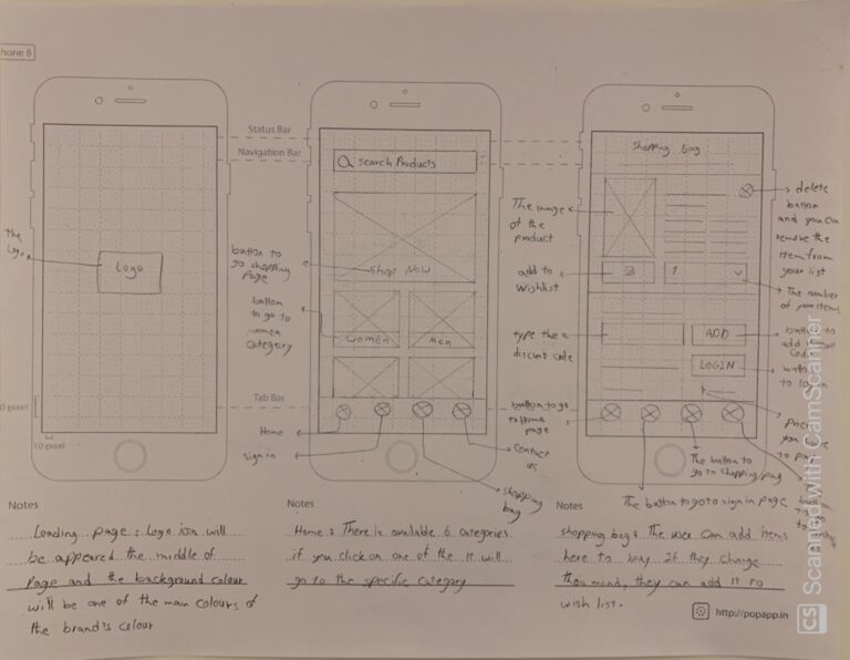
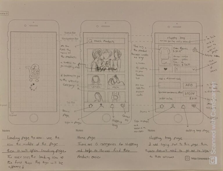
Is the screen more effective than the original and why? Do this for the entire app and every screen.
Hannah Bernaddette:
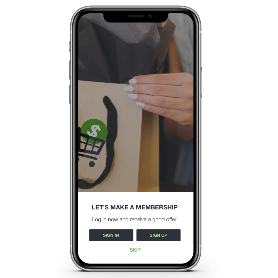
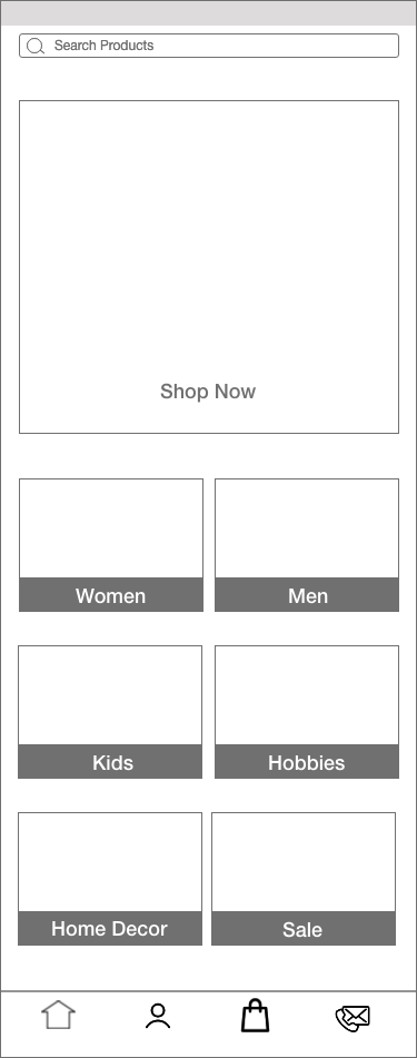
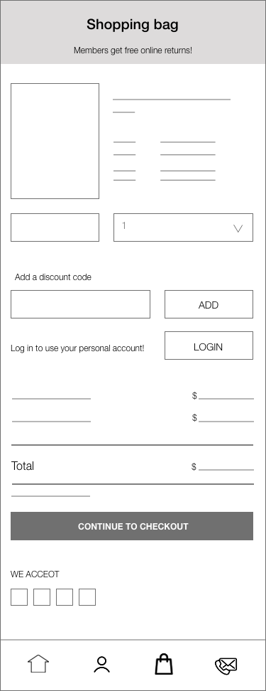
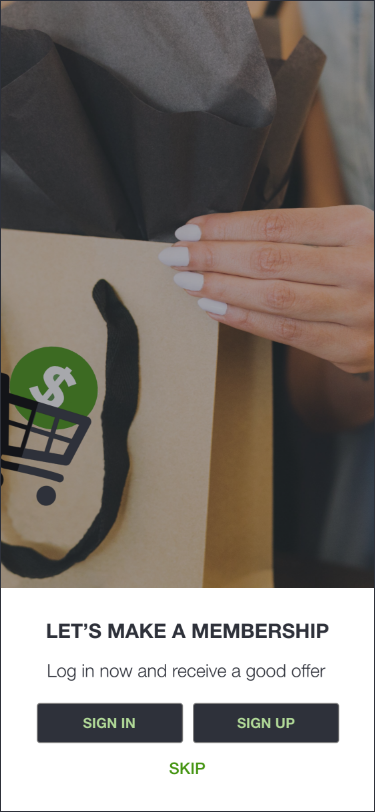
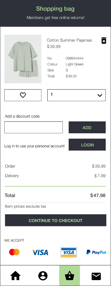
• Yes, she thought it is absolutely an improvement. She loved what I did. She loved the “Landing” page with the “skip” button because she believes people really want to go shopping. She also loved my designed shopping bag, and she thought it is really
impressive and really well done.
• She thought, in general, the colour scheme is really good.
• She suggested adding consistency to the buttons. The home page’s buttons are not capitalized, and the rest of the buttons are capitalized.
• She thought all pages are really impressive.
Nesia Saparno:
• For her, it is hard to read the green font on the black background. She suggests choosing a lighter colour for the font. (Hannah also agreed with her idea.).
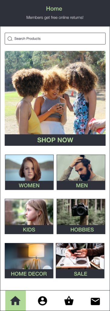
• She suggested adding some source of the header to the “Home” page.
Ben Grant:
• He added a comment to Nesia’s point about the header. He suggested adding a header like the Shopping bag’s header to the “Home” page with a black background and a green title. (Hannah agreed with his idea)
Harman Singh:
• No comment.
Are the UI elements used an improvement?
Hannah Bernaddette:
• Yes, absolutely 100% especially the cards, the card is very good. She loved the “like” button a lot.
Nesia Saparno:
• Yes, 100% and she agreed with Hannah.
Ben Grant:
• Yes 100% it is
• He suggested for the footer maybe try to have a white icon on the green to see how it works instead of having a black icon on the green.
Harman Singh:
• No comment.
Part One
Overall, is the prototype option stronger, and why?
Hannah Bernaddette:
• 100% stronger. She said she cannot stop looking at my Home page’s cards
• She thought the landing page is really impressive. Even if they had a landing page, she would say my designed landing page is absolutely an improvement to the application.
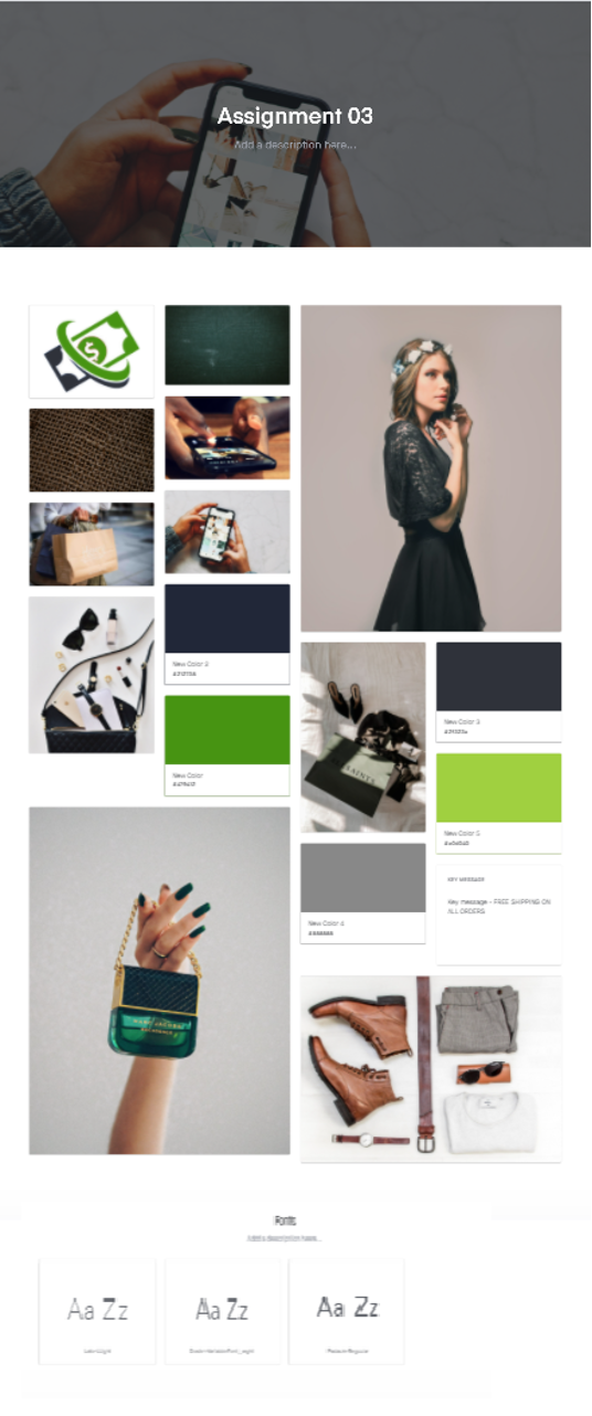
• She really liked the images that I used. She thought the images are simple but they kind of give her a good feeling about the website. She said she could see the big picture, and then there are smaller images for the elements on the website. She thought there is a consistency between the images on the “Home” page. She could imagine the moodboard that I used on my “Home” page, just from looking at the designed website.
She thought the whole application seems very consistent and very well done
• She thought the icons chosen on the footer were very good. She said she really does not need to know what the icons mean; the shape of the icons explains it very well.
• She loved the designed “Shopping bag” page and the overall layout of the screens.
Nesia Saparno:
• She agreed with Hannah
Ben Grant:
• He agreed with Hannah
Harman Singh:
• No comment