Origin Story
The idea for “I Do” originated from a personal experience of planning my sister’s wedding. We noticed the challenges of keeping track of multiple aspects such as the guest list, budget, suppliers, and wedding checklist all in one place. Frustrated with the lack of comprehensive tools available, we decided to create an app that would simplify wedding planning for others. “I Do” was born out of a desire to offer a seamless, user-friendly solution to one of life’s most joyful yet stressful events.
Existing Solutions
While there are several wedding planning apps available, most of them primarily focus on US suppliers and venues. These solutions often lack localized content and features tailored to specific regions. “I Do” was created to address this gap by providing a platform specifically for couples in the Ottawa region. Our app helps users find local venues, suppliers, and other wedding-related services, ensuring that they have access to relevant and region-specific resources to make their wedding planning experience more efficient and personalized.
Research
To ensure “I Do” addressed the needs of users effectively, extensive research was conducted, including surveys and interviews with couples who had recently planned their weddings. Key findings included the need for an integrated budget tracker, a dynamic checklist, and an easy-to-manage guest list. Additionally, research into existing wedding planning tools highlighted the importance of a user-friendly interface and mobile accessibility. This informed the design and feature set of “I Do.”
Goals
The primary goals for “I Do” were to:
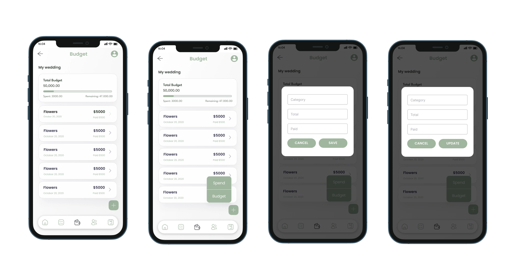
- Provide an all-in-one solution for wedding planning that combines checklist management, budget tracking, guest list organization, and supplier information in the Ottawa region.
- Ensure a user-friendly interface that simplifies the planning process and reduces stress.
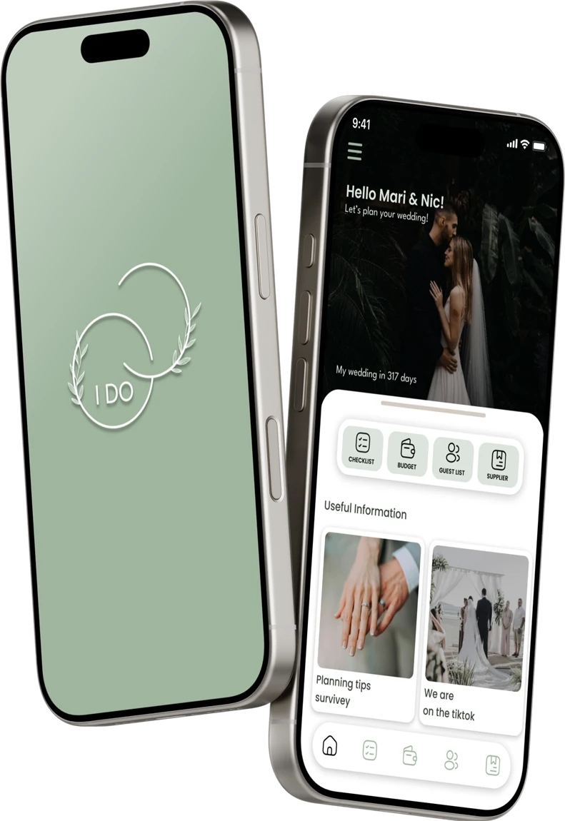
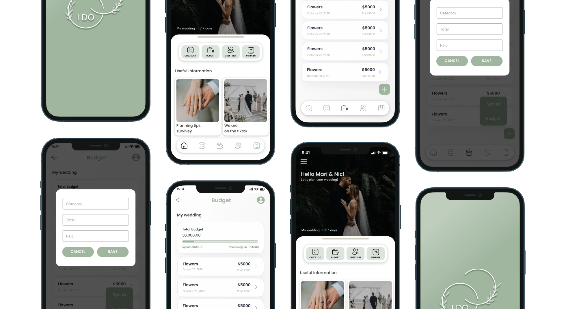
- Offer personalized features such as displaying the number of days until the wedding, set up personal photos, and allowing users to easily manage and update their planning details.
Usage Story
A typical user of “I Do” is a bride or groom who is in the midst of planning their wedding. Upon opening the app, they are greeted with a personalized dashboard showing their name and the number of days remaining until the big day. They can then navigate through sections such as the checklist to track completed tasks, the budget to monitor expenses, the guest list to manage RSVPs, and the supplier list for vendor information. The app allows users to seamlessly update their details, and access all planning tools in one place.
Analysis
Testing
Design testing for “I Do” focused on evaluating both the visual appeal and functionality of the app. We conducted usability tests to assess the clarity of the interface, effectiveness of visual elements, and overall user journey. Key areas of focus included the responsiveness of the design across different devices, intuitiveness of navigation, and the impact of visual cues such as color and typography. Feedback from these tests, including alpha and beta phases with a diverse group of users, led to refinements that improved usability and ensured a cohesive visual experience.
Through this process, we learned that maintaining a consistent design language is crucial for user navigation and professional appearance. Effective visual hierarchy enhances user understanding and ease of access to key information. Integrating user feedback into design iterations revealed valuable insights, leading to a more polished and user-friendly app that meets both aesthetic and functional needs.
Learning
The design process for “I Do” provided several valuable insights:
- Consistency is Key: Maintaining a consistent design language throughout the app helps users navigate more easily and creates a more professional appearance. We learned the importance of consistent color schemes, typography, and iconography.
- Visual Hierarchy Matters: Effective use of visual hierarchy helps users quickly find and understand key information. We found that well-designed layouts and clear visual distinctions between elements improve overall user experience.
- Feedback Integration: Incorporating user feedback into the design process is crucial. Iterating based on real user interactions revealed opportunities to improve aesthetic elements and functional design aspects, ultimately leading to a more polished and user-friendly final product.
Prototype