Perkins is an American casual dining restaurant chain that serves breakfast and other homestyle meals throughout the day.
The goal of this particular project was to re-design their website to have a more organized website with a modern style, better photos, and easy navigation on the website. Promote who they are and what they offer. Encourage their clients to use the website. Increase their clients and therefore, more sales.
Project objective: Create a website to get their name and information out to people. Promote who they are and what they offer. Encourage their clients to use the website. Increase their clients and therefore, more sales.
Target Audience: Old couples with their kids and grandkids or young couples with their friends and kids
Primary: Families
Secondary: Single Females or males between the age between age of 30 to 70
Business goal
Design a website to promote who they are and what they offer
To increase their users and therefore, more sales
To encourage their users to use the website
Proposed design
Designing a modern style and more organized website
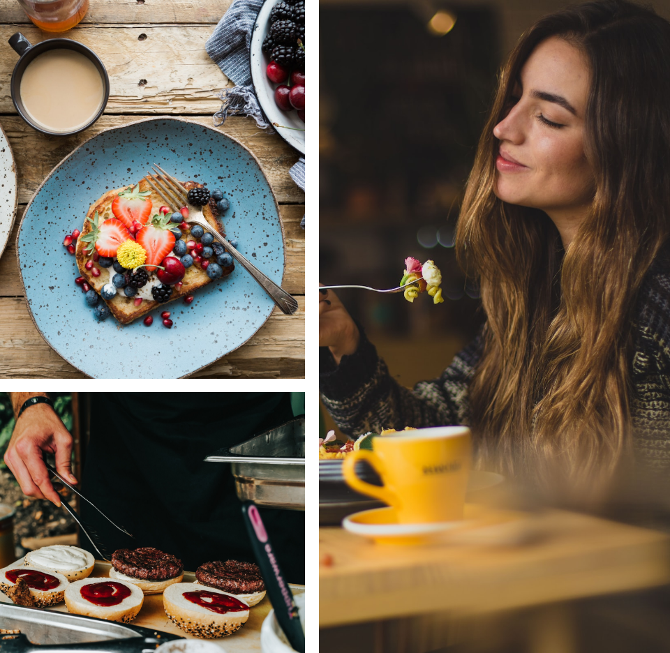
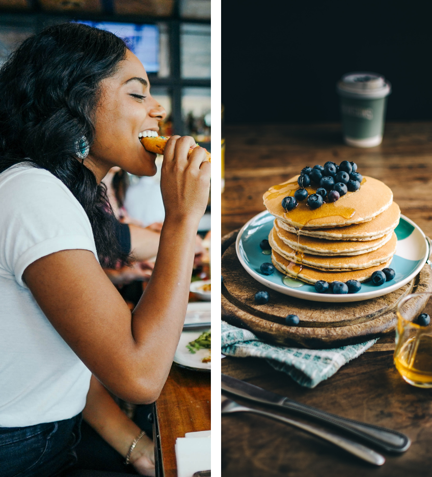
Adding high-quality photography of meals to show freshness and healthiness
Showing family-friendly side of the business
Showing popularity of their restaurant and meals
Personas
The base users are most likely different generations and ages from different countries.
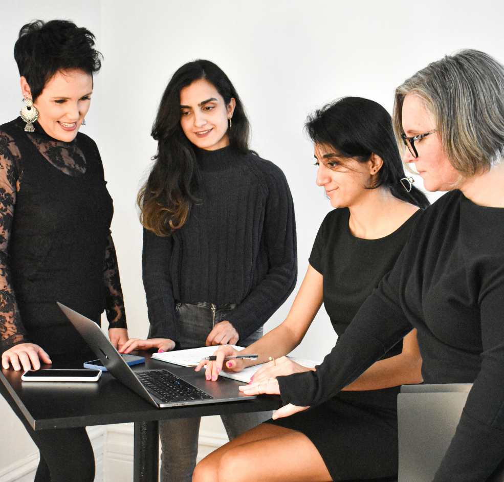
I Provided high-fidelity with prototype, and my team members tested and gave me some feedback.
Perkins website redesign
Overview
Perkins is an American casual dining restaurant chain that serves breakfast and other homestyle meals throughout the day.
The goal of this particular project was to re-design their website to have a more organized website with a modern style, better photos, and easy navigation on the website. Promote who they are and what they offer. Encourage their clients to use the website. Increase their clients and therefore, more sales.
Role
Product Designer
User Research, Interaction, Visual design, Prototyping & Testing
January, 2021 – March, 2021
Background
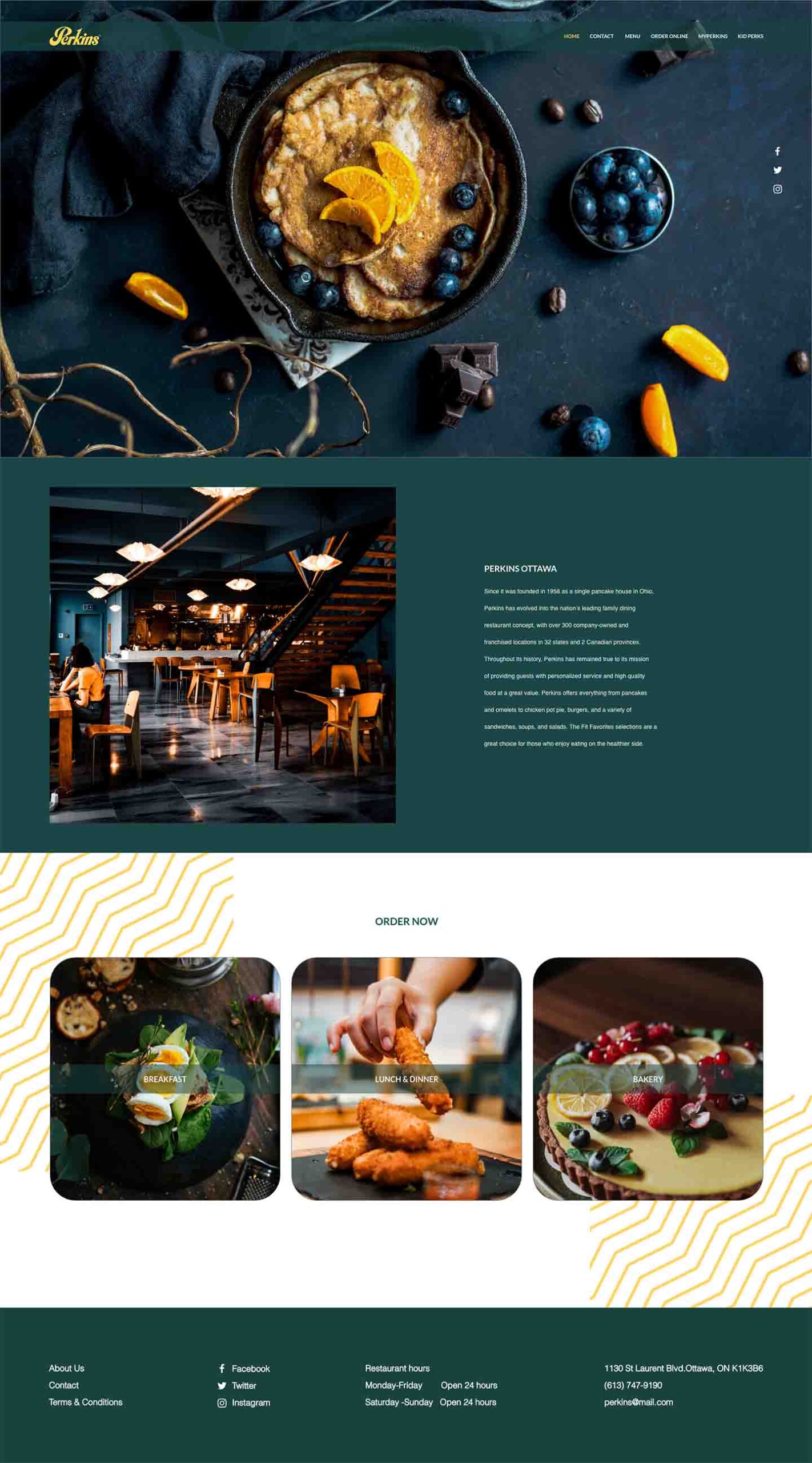
Since it was founded in 1958 as a single pancake house in Ohio, Perkins has evolved into the nation’s leading family dining restaurant concept, with over 342 company-owned and franchised locations in 32 states and 4 Canadian provinces. Throughout its history, Perkins has remained true to its mission of providing guests with personalized service and high-quality food at great value. Perkins offers everything from pancakes and omelets to chicken pot pies, burgers, and a variety of sandwiches, soups, and salads. Visit the current website.
Project at Algonquin College
I had an opportunity to re-design Perkins’s website during my User Experience Design course at Algonquin College. At first, I searched about their company and their values. I searched about their potential clients, their needs, and their desires. After that, I offered a new site map, mood board, and typography for their website. I also re-designed their website for desktop, tablet, and mobile to have a more organized layout and modern style with high-quality photos of meals to attract more clients. I presented my design to my classmates and applied their suggestions to my design to make it more user-friendly.
The Process
The following shows the steps that I work on to create the final version of the website.
The Research
Project objective: Create a website to get their name and information out to people. Promote who they are and what they offer. Encourage their clients to use the website. Increase their clients and therefore, more sales.
Target Audience: Old couples with their kids and grandkids or young couple with their friends and kids
Primary: Families
Secondary: Single Females or males between the age between age of 30 to 70
11-Competition – List competitors (Primary & Secondary):
12- Key message – HUNGRY? FIND A PERKINS NEAR YOU. LET’S EAT!
13- Current/desiredperception – Having a more organized website with a modern style and better photos. Better navigation on the website.
14- Strategic focus – Open 24 hours, available for delivery by ordering online or by phone (to go or to your door). With breakfast available all day and a new kids’ menu.
15- Tone & manner – Family-friendly, healthy, available anytime of the day, fresh.
16- Project mandates – 25 February, 2021
17- What is there a unique selling point of a product or service– Throughout its history, Perkins has remained true to its mission of providing guests with personalized service and high-quality food at a great value.
Join MyPerkins E-CLUB and save 20%.
18- What is the emotional benefit – Please every palate, satisfaction, confidence
19- Creative considerations –
Organized layout
Update photo
Modern style
20- Strategic plan – In the future, the Perkins system provides plenty of flexibility for short- and long-term changes. From converting existing structures to prototype designs that are designed for expansion, to large and flexible kitchen configurations to accommodate new technologies and food preparation techniques, Perkins has shown it can adapt well to market trends
21- What is the objective – Create a website to get their name and information out to people. Promote who they are and what they offer. Encourage their clients to use the website. Increase their clients and therefore, more sales.
Tone-of-Voice
Family-friendly
Perkins is the family-friendly choice that offers something to please every palate! To show this on the designed website, we used the kids’ option on the nav and also added kids’ photos to our website.
Healthy
Perkins offers the Fit Favourites selections that are a great choice for those who enjoy eating on the healthier side. To show this on the designed website, we used photos that are from healthy ingredients.
Trustworthy
We wrote this on the first page to show how long they were around and how popular and trustworthy their restaurants and foods are:
“Since it was founded in 1958 as a single pancake house in Ohio, Perkins has evolved into the nation’s leading family dining restaurant concept, with over 300 company-owned and franchised locations in 32 states and 2 Canadian provinces.”
Fresh
To show this on the designed website, we used photos that are taken from fresh foods and fruits.
High quality
To show this on the designed website, we used photos from high-quality foods and also wrote this on the first page: “Perkins has remained true to its mission of providing guests with personalized service and high-quality food at a great value.”
Target Market Research
Demographic
Name
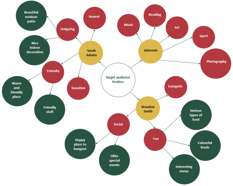
Sarah Adams
Brandon Smith
Gender
Female
Male
Age
35
21
Education
Bachelor degree
College degree
Position
Customer service
Photographer
Salary
+40K
+50K
Psychographics
Name
Sarah Adams
Brandon Smith
Opinions
Extrovert
Eidetic memory
Personality
Sensitive, Friendly, Outgoing
Social, Energetic, Funny
Values
Honest
Reliable
Activities
Yoga, Basketball
Climbing, Jogging
Attitudes
Organized
Productive
Interests
Baking, Learning new stuff, Art
Photography, research, music
Lifestyles
Simple
Married with one-year-old son
Energetic, Single
Always looking for new adventure
Geographic
Name
Sarah Adams
Brandon Smith
Location
Orleans, ON
Ottawa, ON
Personas
Mind Map
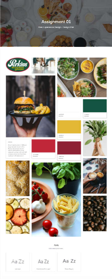
Mood Board
Typography
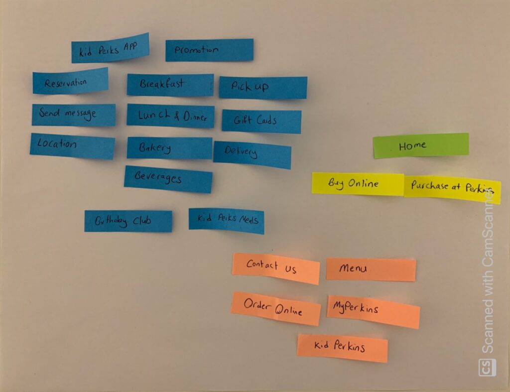
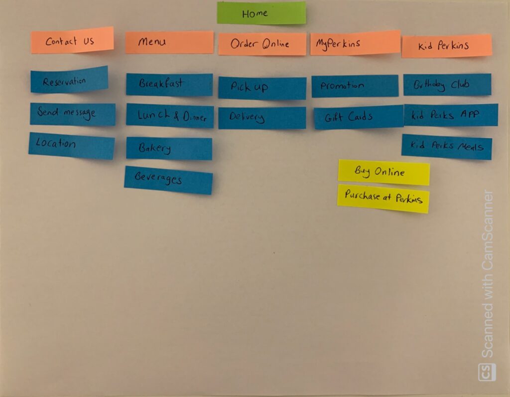
Stickie notes
1st step
2nd step
Site Map
Usage Scene
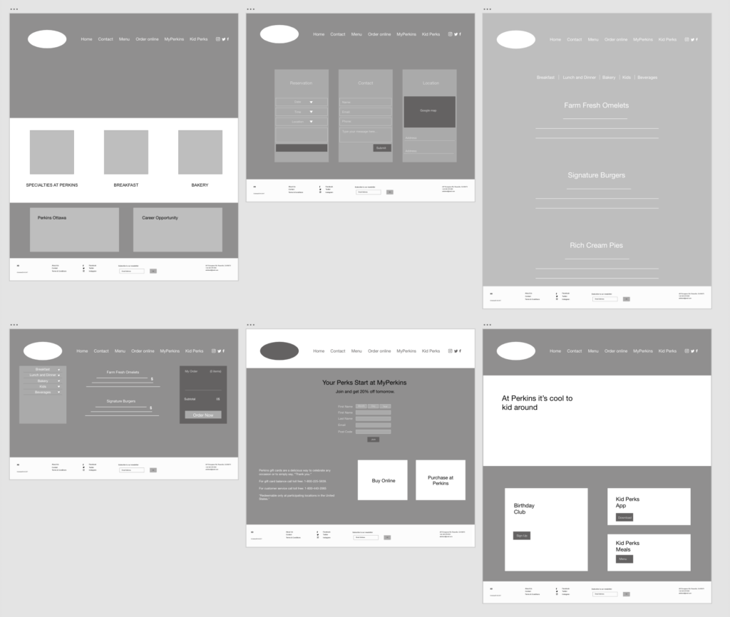
The user opens the website.
The user sees the Home page that is pretty modern, simple, and stylish. There is no confusion with so much information and details.
The menu bar shows links to the important pages on the website.
The user clicks on Contact (the second item on the menu bar)
The user can make an online reservation or find the number to call and reserve a place on this page.
The user can share their experience and thoughts with the manager on this page using the send a message option.
The user can find the location of the restaurant.
The user clicks on Menu (the third item on the menu bar) to see the menu.
This page contains the menu for breakfast, lunch & dinner, kids, and beverages.
The user can click on a different menu and see the foods and drinks. The user can also check the price of each food and drink on this page.
The user clicks on Order Online (the fourth item on the menu bar).
The user can choose between the pick-up or delivery options on this page.
The user clicks on MyPerkins (the fifth item on the menu bar) to find out more about promotions, special offers, and gift cards in this restaurant.
The user can order a gift card online or pick it up at the restaurant.
The user clicks on Kid Perks (the sixth item on the menu bar)
The user can see links to the Birthday Club, kid Perks App, and Kid Perks meals.
The user clicks on Home(the first item on the menu bar) to bring him back to the Home page.
There are also links to social media such as Twitter, Facebook, and Instagram on the menu bar that the user can click, and it will open the social media page of this restaurant.
User Flow
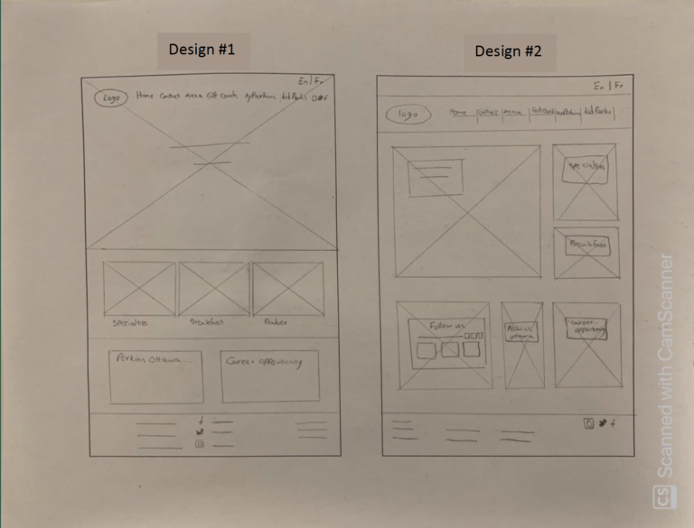
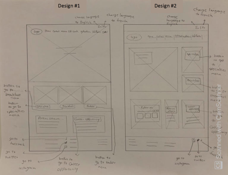
Low-Fidelity Paper Prototypes
Wireframe Sketches
Buttons' description
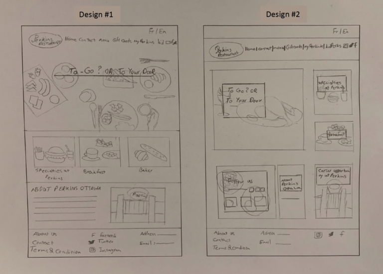
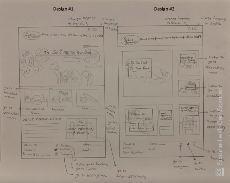
High-Fidelity Paper Prototype
Wireframe Sketches
Buttons' description
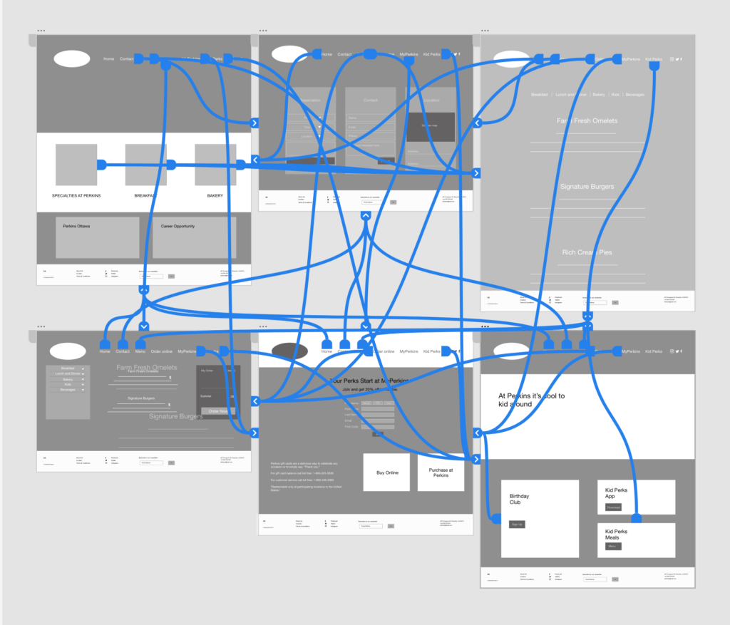
Low-Fidelity Digital Prototype in XD
Site Interaction Map in XD
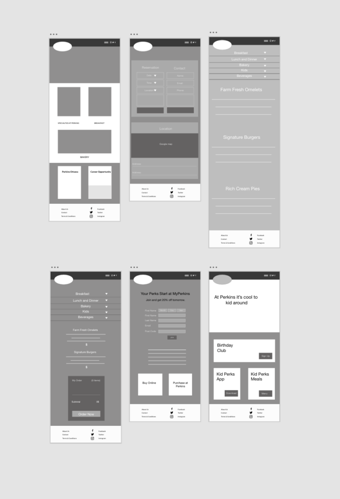
Low-Fidelity Digital Prototype
Desktop
Tablet
Mobile
Digital on-line presence
Focus Group
Part 1
1. Is the banner considered effective, and why?
Tina Octaviani:The banner is effective, and she suggested blurring the main photo of the home page.
Nathan Saunders: Increase the appearance of the yellow colour behind the text and blur the main photo.
Hamid Siddiqi: Align the white space between the photos at the middle of the home page
2. Which UI elements need improvement, and why?
Tina Octaviani:
On the Home page make your image wider so there is not too much white space but if it is intentional to have a square image, it is fine.
Remove the social media from the top of the page and just keep it on the footer, and then align your nav buttons to the right.
Your footer left side has more information, but the right side is mostly empty. Align the white space between your text.
Separate your footer. It is the same color as your section.
On MyPerkins page, it is better to add the buttons below your photos for “Buy Online” and “Purchase at Perkins”.
Nathan Saunders:
On the contact page, bring the submit buttons down so that they are aligned with the second address line in the location box.
On the Order Online page, it is better to give a background to the menu that can separate it from the whole page.
Hamid Siddiqi:
On the MyPerkins page, “Buy Online” and “Purchase at Perkins” looks more like header rather than a button. Maybe add an underline to the text to show it is clickable. Or increase the size of the background and change the size of the font.
On the Home page, make the Perkins Ottawa and Career Opportunity boxes align.
3. Which layout choices were considered the strongest, and why?
Tina Octaviani: Home page because of choosing good photos.
Nathan Saunders: Home page because it is clean and organized.
Hamid Siddiqi: Home page because it seems clean.
4. Was the site easy to navigate, if no, why?
Tina Octaviani: Yes, it is easy to navigate.
Nathan Saunders: Yes, it is easy to navigate.
Hamid Siddiqi: Yes, it is easy to navigate.
5. Was the site intuitive, if no, why?
Tina Octaviani: All look good in general. The colour of the footer should be consistent and one colour. Maybe use the red colour that comes from one of your main logo’s colour and if you think using red make your page so colourful you can use it with different capacity and shade it a little bit.
Nathan Saunders: Colours are chosen good, and photos are selected well. He had the same idea as Tina about the footer’s colour.
Hamid Siddiqi: Check again the size of photos that you put on the home page; they do not seem they have the same size.
Part 2
1. Is the banner effective, and why?
I think on the home page it is better to increase the tone of yellow colour and to blur the main photo, it makes my tone more readable.
2. Which UI elements need to be improved?
I should remove the social icons from the nav and just keep them on the footer.
On MyPerkins page, I should add the “Buy Online” and “Purchase at Perkins” buttons below the photos, because I think maybe the user gets confused with the text at the top of the photo and does not know where to click. Also, I should change the font size of “Buy Online” and “Purchase at Perkins”
On the Order Online page, I should add a background to the menu that can separate it from the whole page.
3. Which layout choices are the strongest, and why?
I have the same idea with my teammates, I think my home page is effective and clear. The user’s eye can follow the page layout as its organized well.
4. Is the site easy to navigate?
My website is easy to navigate because of the easy layout that I chose.
5. Is the site intuitive?
I think I have to choose one colour for all footers and make it consistent. It was a bad idea that I tried to give some footers green and the other white. I should recheck the size of the photos and check the white spaces between them.