Type
E-COMMENRCE
Client
Smart Radish Digital Marketing
Role
UXUI | WEB DEVELEPER | SEO Maestro
Launch
Smart Radish
Smart Radish is a digital marketing agency in Carleton Place offering range of services is designed to amplify your brand’s digital presence and drive tangible results.
As the Co-Founder & SEO Maestro, UX/UI Designer and Developer for Smart Radish, I redesign the website, created and launch it, through the UX process of creating this new, user-friendly, responsive web design.
Deliverable
- Research
- Creative Brief
- Target Market Research
- Personas
- Mind Map
- Mood Board
- Site Map
- Learning Objectives
- Low-fi Wireframes
- Prototypes
- High-fi Mockups
- Implement in Shopify and launch
- Created a storytelling video for the home page
- Edited photos to match the website
User Research
Project objective: Create a website to get their name and information out to people.
Promote who they are and what they offer. Encourage their clients to use the website.
Increase their clients and therefore, more sales.
Target Audience: Small and local businesses, and social media Influencers
Primary: Small and local businesses
Secondary: Social media Influencers

Home Page Storytelling Video
To improve the user experience on the homepage, I integrated a dynamic video section designed to captivate visitors immediately upon arrival. The video, composed of engaging short clips and a compelling narrative, aims to draw the audience in and encourage them to explore further.
The video featured as the hero image at the top of the page.
Key Enhancements:
- Storytelling: The video weaves a narrative that not only introduces the company but also highlights its values and services in an engaging manner. This approach ensures visitors are both entertained and informed.
- First Impressions: Understanding the importance of a strong first impression, the video was crafted to immediately capture attention and establish a connection with the audience. This helps in reducing bounce rates and increasing the time spent on the site.
- Building Trust: The content of the video is designed to build trust with potential clients by showcasing the company’s expertise and reliability. Through well-curated visuals and authentic storytelling, the video aims to position the company as a trusted partner in their marketing endeavours.
Enhancing Website Navigation for Optimal User Experience
A critical aspect of web design is ensuring intuitive and efficient navigation, allowing users to find what they need quickly and easily. In my portfolio project, I focused on creating a navigation system that enhances usability and improves the overall user experience.
Simplicity: The navigation menu is designed to be simple and straightforward. By minimizing the number of menu items and using clear, concise labels, users can easily understand where each link will take them.
Consistency: Consistent placement of the navigation menu across all pages ensures that users always know where to find it. This predictability helps in reducing the learning curve and enhances the overall user experience.
Responsive Design: The navigation system is optimized for all devices, providing a seamless experience on desktops, tablets, and smartphones. This includes the implementation of a hamburger menu for mobile users to ensure a clean and uncluttered interface.
User-Centered Design: The navigation structure is built around the needs and behaviors of the target audience. By conducting user research and testing, I identified the most important sections and ensured they are easily accessible.
Search Functionality: To further enhance usability, I included a search bar that allows users to quickly find specific content or products. This feature is especially useful for large websites with extensive content.
Benefits:
Improved Usability: Users can easily find what they need without frustration, leading to a more enjoyable browsing experience.
Reduced Bounce Rates: Clear and efficient navigation helps in keeping users on the site longer, reducing bounce rates and increasing engagement.
Enhanced SEO: Well-structured navigation improves site crawlability, aiding search engines in indexing the site more effectively, which can lead to better search rankings.
By focusing on these principles, I aimed to create a navigation system that not only meets the users’ needs but also supports the overall goals of the website.
Enhancing User Experience with Animations
To further improve the user experience, I incorporated subtle animations that enhance interactivity and engagement. These animations make the website feel more dynamic and responsive, creating a more enjoyable browsing experience.
Button Animations: Adding animations to buttons helps provide visual feedback when users interact with them. For example, buttons can slightly change colour when hovered over or clicked. This not only makes the interface more intuitive but also encourages users to engage with call-to-action elements.
Scroll Animations: Implementing animations that trigger as users scroll down the page can make the browsing experience more engaging. Elements can fade in, slide in as they come into view. This approach helps in guiding the user’s attention to important content and breaking the monotony of a static page.
Benefits:
Improved Interactivity: Animations provide immediate feedback to user actions, making the website feel more interactive and responsive.
Enhanced Engagement: By making the browsing experience more dynamic, animations can capture and retain user interest, leading to longer session durations.
Visual Guidance: Scroll animations help guide the user’s attention to key sections of the page, ensuring important content is not missed.
These animation enhancements are designed to create a more engaging and user-friendly website, ultimately leading to a better overall user experience.
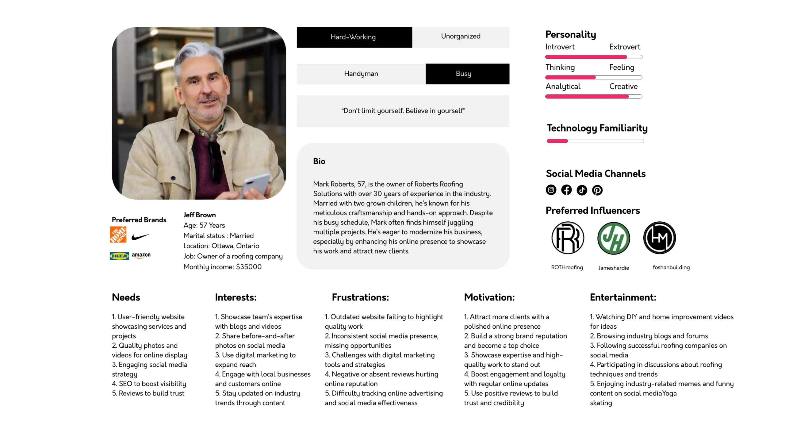
Personas
The base users are most likely brides, bridegroom and their families.
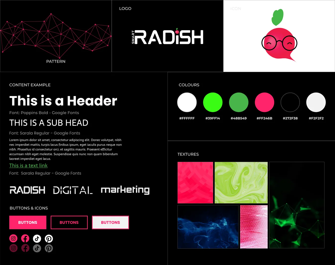
Suggested Mood Boards
First Version

Second Version

Final Mood Board